


Image: Shutterstock AI
Early on in our media careers, most of us were taught about the sanctity of logos. The unwritten law states that while brands should experiment with content, logos are sacred and should not be messed with.
But marketers are breaking the rules, especially as consumers are deluged with new brands and their accompanying logos. Capturing the attention of an often overwhelmed public has never been more challenging.
That’s why we’re seeing more risk-taking, not just with content, but also with brand visualization and representation. In other words, logos.
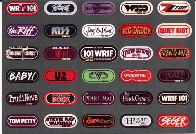
JacoBLOG readers know this is one of those near and dear topics to me. At WRIF nearly 40 years ago, we made the discovery that our logo shape was overwhelmingly familiar. As a result, we could fill it with a lot more than just the station frequency and call letters. And that started hundreds of “mini-campaigns” where bands, area sports teams, events, and station personalities filled in that well-known racetrack shape.
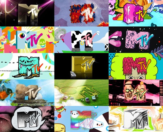
Meanwhile, over at MTV, they were on a similar mission to repurpose their highly familiar logo to suit whatever their marketing needs turned out to be. Over time, their iconic look morphed and evolved into all sorts of interesting visual modifications. And yet, you always knew you were watching something from MTV.
But rock radio and music television have always been somewhat loose and playful. What about brands that represent institutions? Apparently, they’re on the same trajectory.
A story earlier in the month by Creative Blog explains how Disney and Hulu came together to mindbend their logos in an outdoor campaign. The story’s title, “We’ve never seen a Disney billboard like this before” by Daniel John tells the story about a Canadian agency, aptly named Courage, that did the unthinkable—truncating each brand’s logo to make the point that viewers can now access Hulu content on Disney+.
On the billboard below, those familiar eyes belong to Kim Kardashian, making the point her and her family’s famous show on Hulu can now be streamed on Disney’s premium channel:

Courage shared its clever creative on LinkedIn where the comments were overwhelmingly positive. After all, we are so accustomed to seeing bundles between two media brands that it’s hard to stifle the yawns when a new one is unveiled.
But this campaign is designed to make you double-take, and yet, its message is concise and clear.
At a time when marketing-starved broadcast radio stations are desperate for visibility and attention, a tactically smart play on the station’s logo might provide an attention-getting opportunity.
The question, “Hu Dis?” makes for a compelling visual. How can highly familiar radio logos serve the same purpose the Courage team pulled off—with a little twist, of course.
I find these marketing “What if?” conversations inspiring. And as I was putting together this post, another variation on the two logos might just work for their comedy programming or a sequel campaign:

OK, back to my day job.

President & Founder at Jacobs Media
Jacobs Media has consistently walked the walk in the digital space, providing insights and guidance through its well-read national Techsurveys.
In 2008, jacapps was launched – a mobile apps company that has designed and built more than 1,300 apps for both the Apple and Android platforms. In 2013, the DASH Conference was created – a mashup of radio and automotive, designed to foster better understanding of the “connected car” and its impact.
Along with providing the creative and intellectual direction for the company, Fred consults many of Jacobs Media’s commercial and public radio clients, in addition to media brands looking to thrive in the rapidly changing tech environment.
Fred was inducted into the Radio Hall of Fame in 2018.
